Friday, April 6, 2012

Before you panic about the employment report -- Some context

The monthly employment report was released today and while the economy continues to add jobs the report did not meet expectations.  (As of writing this on Friday afternoon SP500 futures were down 1+% while long term bond futures were up +1.3%)

Here's a longer term chart of the year over year percentage change of total employment as reported by the government and ADP. (ADP is in red)
Employment
Source: Federal Reserve

Employment is still growing but the rate of growth is looking like it may top in the near future.  If in the next couple of months you see these metrics really roll over then I'll be hitting the REAL panic button but right now the slow grind upwards still appears valid.

That being said I'm not suggesting you go out and buy stocks.  If America slows down from our already tepid growth as Europe falls back into recession and China continues to slow the world could be in some serious trouble. (All in all I'm not too enthused about equities right now as they have already had a huge run from late last year.)

Just please keep this chart in mind if the markets are down on Monday and the financial press is in a lather about it all.

Tuesday, March 27, 2012

Peering into China via trade statistics

Getting accurate information on China is a challenge. While its hard to prove they are making their numbers up I don't put much credence in many official statistics released from the Glorious Workers Paradise. (WSJ June 2011, Reuters December 2010)

Fortunately there are other ways of observing China, from their borders specifically.  Trade statistics between the Middle Kingdom and the US is actually reported and available from US sources.  The story they tell show of slowing trade between the countries in both directions.

Year over year % change of 3 month average
Source: Federal Reserve
While the graph above is smoothed and lagged quite a bit one can see both China and the US's decline in 2008/09 and China's massive resurgence in 2009 and the US a few months later.

Right now the story is also one of declining growth of trade in both directions.  

Of course trade partners may and will shift their vendors around from country to country so this data should be looked at with some large error bars on the data, but this slowdown is something to keep an eye on as a coincident/lagging indicator of each countries economic trajectory.

Wednesday, March 14, 2012

Diesel usage diverging from overall economy

While the economy has been recovering nicely from the Great Recession there are some interesting divergences which are popping up with this recovery.  One of them which has been discussed elsewhere in the blogosphere (sorry no links) is the apparent divergence between fuel usage and economic activity.

Diesel fuel usage
The Ceridian Index reports monthly on diesel fuel used by the trucking industry.   Unlike retail sales which continues upwards the Ceridian fuel index is now declining on a year over year basis. From their most recent report you can see the decline.

One can see in the next chart the apparent divergence between retail sales and diesel usage.

The researchers at Ceridian note the divergence as well and have a possible solution  Unlike the rest of the economy which is improving on a year over year basis, the housing market remains stuck in the duldroms and is still sputtering along the bottom. (See page 6 in the above linked report)

While productivity improvements are also possible I find it unlikely the rate of improvement would be enough to create the entire divergence.  Perhaps the lack of a growing home market and improved fuel usage (or the continued virtualization of our economy) are enough to close the gap between retail sales growth and flat fuel usage.  Only time and further research will tell.  Regardless this indicator bears watching.

Fuel usage and retail sales

Monday, March 12, 2012

Revising employment data

In my last post I promised to look at how employment data is being revised over time. On Friday the latest employment data was released and previous data was revised upwards in both the seasonal and non-seasonal data series. While this graph below shows data from just last months revision I may start showing multiple threads to see how the revisions change over time once we have more data.

I know, not much data to look at yet. Hopefully we'll see something interesting as time progresses. 

Wednesday, February 8, 2012

This post (and employment data) will be revised

The recent employment report has been a great point of contention between the bulls, bears, and the black helicopter crowd. I won't rehash the report but there's something I mentioned in a previous posting about employment seasonality that caught my attention.

The beginning of a new year brings a large number of layoffs as seasonal workers for the holiday shopping rush are released.  As you can see from this first graph the non seasonally adjusted data and adjusted data vary greatly right now.
Total nonfarm payroll 
The difference is rather obvious to see but lets transform the data a bit and look at the difference between the normalized and raw data.


Subtracting one from the other exposes just how much the raw data can vary from the the adjusted data in an attempt to smooth out the seasonality of the data.  As can be seen we are at the peak of this delta and it will most likely be revised in the future due to the fact we are that noisiest point in the data collection period.  Will it be revised up or down? I haven't a clue, but I'm going to watch it and report to you how much these data series change over time.  Stay tuned.

Monday, February 6, 2012

A housing update -- at best a flat market

Over the last few years during conversations with clients I've frequently been asked my opinion about the housing market and whether now is a good time to buy.  Home prices are naturally a point of conversation as they are a large part of most people's net worth and the loss of equity is preventing some people from moving up or refinancing.  So the question of whether we are at the bottom of home prices is an important one.  Unfortunately I don't think we are at the absolute bottom of home prices and we will most likely continue to see a slow decline in prices in the near future.  My non-prediction for 2012 is we will not see a rebound in home prices; at best we'll see a flat to slightly down market.

Home prices have strong local factors so this conversation is about national trends, your local market will vary.

Unfortunately right now home prices are continuing their decline nationwide:
Home prices still dropping - (Source: Paper Money)


Outstanding mortgages still contracting
Mortgage loan balance still declining
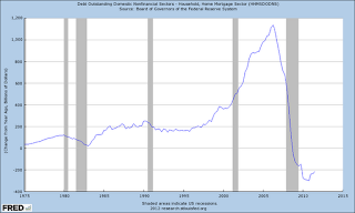
There are several headwinds the housing market needs to overcome before it is fully healed. This chart shows the change in mortgage values outstanding since 1975 (Source: Federal ReserveLooking at loan balances to predict home prices may seem counter intuitive but remember a rising total national loan balance means there are more buyers (and borrowers) entering the market.  Some interesting aspects of this chart are how even during other previous recessions (shown in gray) the value of outstanding mortgages continued to rise on a year over year basis; until our most recent recession in 2008/2009.  This was the first time during this entire data series when the total value of all mortgages outstanding declined on a year over year basis. One would not be engaging in hyperbole to call our current decline in home prices exceptional.

An overhang of foreclosed homes
While it appears the primary wave of home foreclosures is past us there still is a large backlog of homes in the foreclosure process. Until this backlog is completely cleared and returns to more 'normal' levels, the amount of housing coming on the market by 3rd parties (not the person who currently lives/owns the home) will put downward pressure on prices.

Single family delinquency rate (Source: CalculatedRisk)

Another negative factor is the hidden inventory of homes out there from people who want to move up or out but are waiting until home prices stabilize before putting the place on the market. I personally know of a few people who are accidental landlords and are hoping and waiting until prices stabilize before putting their rentals on the market.  While this is purely anecdotal I'm sure its not just a local or isolated phenomenon.

Renting versus Owning coming into balance
Fortunately there are some positive factors which should mitigate a continued decline in home prices.  Home prices and mortgage rates have declined to the point where a mortgage now equal to rent.
Rent versus Owning (Source: Soberlook)
As you can see for a very long time it was cheaper to rent versus own. We are approaching a point where this may invert and owning a home would be cheaper than renting. There are other upkeep and time costs associated with home ownership (as a homeowner I can assure you there are many!) but the primary costs are approaching parity.  

Clearing the excess inventory
The number of unsold homes is beginning to stabilize as a percentage of US population.  The hidden inventory is of course hard to measure but at least we are getting closer to 'normal' for this data series
Unsold homes as % of population - (Source: Sober Look)

The long decline in construction spending does appear to be finally over which will help the building trade and stop being a drag on overall GDP growth.
Construction finally bottoming? (Source: Federal Reserve)

Even though the housing market decline appears to be slowing forecasting when we finally reach bottom is not something I'm willing to predict right now. I believe the worst of the declines are behind us so if you are looking for a home now would be a good time to start looking but be picky and drive a hard bargain! There is going to be lots of supply coming on the market over the next few years.

One aspect of the crushing decline in home prices is it has popped the speculative mindset so very prevalent in American thinking a few years ago. (I'll admit to falling a little under that spell myself)  Take your time and find a house to live in, not one for profit.

Additional reading:
http://www.calculatedriskblog.com/2012/01/fannie-mae-serious-delinquency-rate.html
http://soberlook.com/2012/01/two-data-points-on-us-housing.html
http://paper-money.blogspot.com/2012/01/new-home-sales-december-2011.html
http://soberlook.com/2012/01/five-reasons-2012-will-be-start-of-us.html
http://paper-money.blogspot.com/2012/01/radar-watching-november-2011.html
http://paper-money.blogspot.com/2012/01/fhfa-monthly-home-prices-november-2011.html
http://paper-money.blogspot.com/2012/01/radar-watching-november-2011.html
http://pragcap.com/why-home-prices-have-much-further-to-fall
http://www.tilsonfunds.com/JohnBurnshousing.pdf
http://research.stlouisfed.org/fred2/graph/?graph_id=62720&category_id=4082
http://research.stlouisfed.org/fred2/graph/?graph_id=64527&category_id=4082
Calculated Risk calls a housing bottom
http://www.calculatedriskblog.com/2012/02/housing-bottom-is-here.html

Monday, January 23, 2012

Observation of the day: Greeks are not Germans

It may appear an obvious observation but to the euro and (for a while at least) the bonds markets Greeks and Germans were the almost exactly the same. Twins.

Two recent pieces on public radio highlight how very different from the Germans the Greeks can really be.

The first radio spot describes the failed efforts of a Greek computer scientist to make the revenue system (the tax man) more efficient in Greece. All he thought they needed was a little technological help to point them in the right direction.  Heh, not quite.
http://www.npr.org/blogs/money/2012/01/05/144747663/how-a-computer-scientist-tried-to-save-greece?ft=1&f=100

This longer piece (nearly an hour) aired this weekend and I caught it on Saturday.  It goes into the desire to create the euro and how Greece basically lied to get into the eurozone and the epic borrowing binge Greeks went on after 'easy money' appeared after the Euro was introduced.  While its long it is a good overview of how Europe got into this mess.
http://www.thisamericanlife.org/radio-archives/episode/455/continental-breakup

Greece's credit history is not the best.  Since their independence in the early 1800's they have spent more than 50% of their time in default. (This time is different, 2008, Reinhart & Rogoff, page 99) Do you really think they would adopt the fiscal discipline of Germany after being handed their unlimited gold card?

ht @BarbarianCap