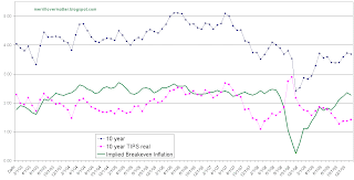
A refreshed chart from the Fed of the inflation expectation spread (10 year nominal yield minus 10 year TIPS yield) teases out some interesting items to consider.
 |
| 10 year nominal Treasuries minus 10 year TIPS (source: Federal Reserve) |
Note how we have recently broke above the 2.5% Since the GFC it has rarely breached this mark and did not stay there for long.
Now look at when previous QE's were initiated. A graph by dshort.com does the job.
While they are not to the same scale, you will notice the first round of QE was initiated during the deep dark days of the financial crisis. The inflation expectation spread was near its low of the series and the world looked bleak.
QE2 was discussed mid 2010 and also coincided with an interim dip in the inflation spread at around 1.5%
QE(infinity) was just announced and our inflation expectation spread is already near the highs of the entire series.
While the Fed and other market participants have their own flavor of inflation expectations they look at this series is near its highs. Before the GFC this spread didn't venture much higher and the Fed thinks they can get it higher now? The future is subject to change (of course) but unless we get some serious wage growth it appears to me the Fed is pushing up against a long term inflation expectation wall.
As an example here's nominal Personal Consumption Expenditures. It has been on a secular decline since the inflation days of the 80's and also notice how it recently peaked and appears to be rolling over again (ahem)
 |
| Nominal PCE - Source Federal Reserve |
For some additional context here's the 10 year nominal and TIPS yield since 2004. Notice how now 10 year TIPS are now going for a negative real yield.
Disclosure: Considering selling/shortening duration on some TIPS positions


