Thursday, September 12, 2013

Peak Hurricane?

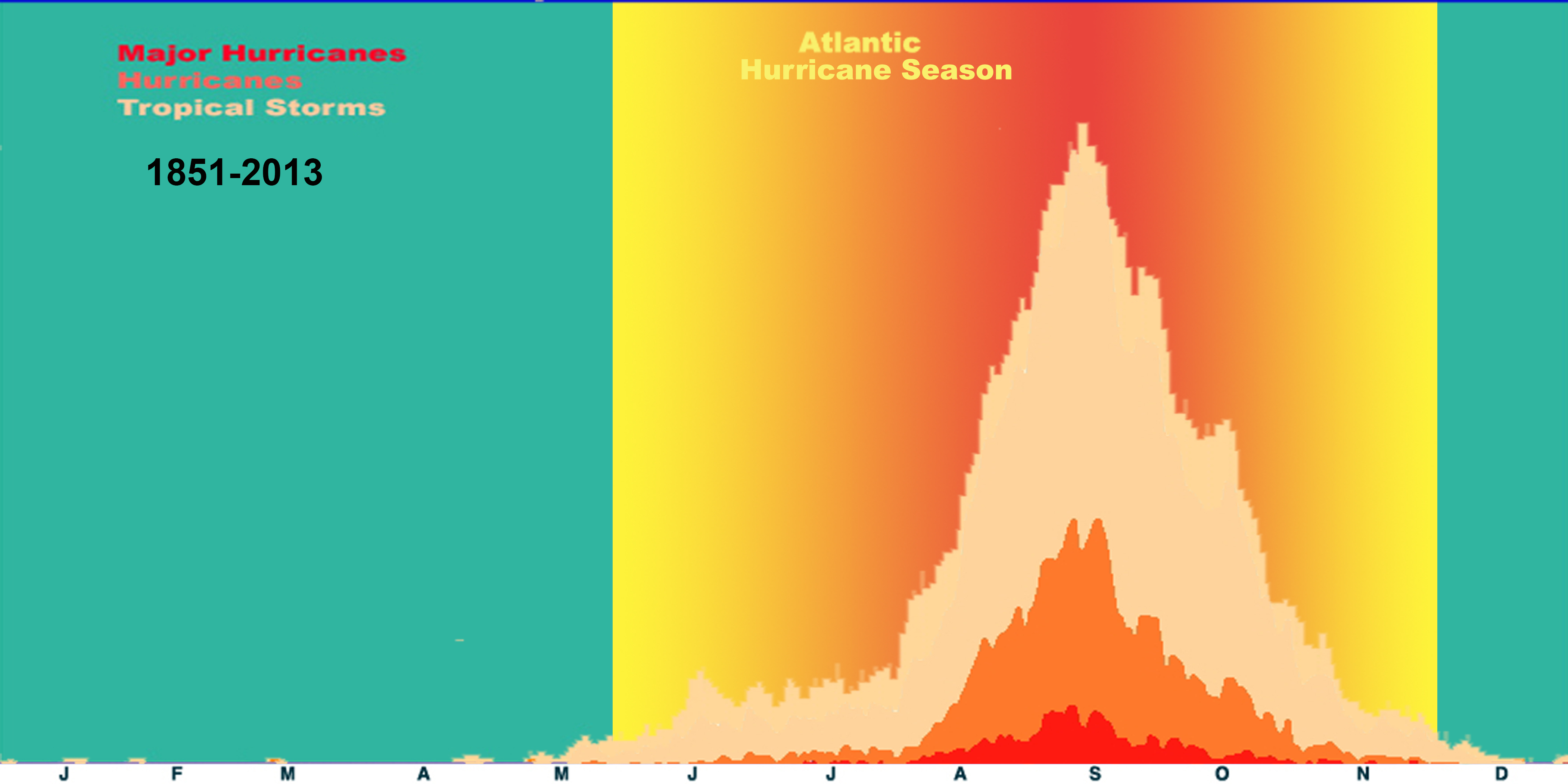
Atlantic hurricane frequency - source: NOAA
So far this year we have been blessed by a lack of hurricanes on the East Coast.  As the accompanying graphic shows, we are past peak hurricane season this year without any major storms.  Of course statistics only work with a large sample size. Hurricane Sandy from last year is an unfortunate contrary example.  She struck in the last few days of October and as you can see from the accompanying graph this is supposed to be rather uncommon.   This doesn't matter to someone whose home that was demolished by Sandy.


As of right now the coast does look rather clear except for one storm named Humberto near Africa.  The current forecast is for it to rise to hurricane force winds and then fall back to a tropical storm.  One can keep an eye on any storms forming at http://www.nhc.noaa.gov/  During hurricane season I open this window every day to see if anything is forming on the horizon.


Beyond the horrible damage, death and destruction a hurricane inflicts upon society they also play havoc with a portfolio.  Reinsurance firms, oil service companies, oil and natural gas exploration firms, and even utility companies are but a few of the sectors which can be adversely affected by one slamming into America.    Keep an eye out for upcoming storms and also consider stress testing your portfolio. If a major hurricane hit the East Coast how would it affect your portfolio?  Do all your energy stocks have Gulf of Mexico fields? What's the risk with your insurance firms, reinsurance firms?  

Disclosure: Own stock in pipeline companies, reinsurance, oil service, and major oil & nat gas companies

Edit: Reuters also notices the lack of meteorological violence this year 

Wednesday, September 11, 2013

The rising oil choke collar


Oil prices are on the upper end of the post 2008 financial crisis range. So far each time prices rose to the 110+ region they have backed down again.


Gasoline and Oil prices - source: Federal Reserve


While Syria has been getting all the news, Libya's declining oil production may be another reason for firm oil prices. A recent WSJ article (September 10, 2013) highlights the situation.   Considering the vast majority of Libya's GDP is derived from the energy sector (CIA Factbook) this does not bode well for the new post Gaddafi Libya.

I suggest keeping an eye on the price of oil. If it gets much higher it may temper the recent positive economic news.

Additional reading:
http://en.wikipedia.org/wiki/Economy_of_Libya
http://en.wikipedia.org/wiki/Libyan_civil_war

Disclosure: Own oil service, energy, and pipeline stocks

Friday, May 31, 2013

Divergence in employment growth numbers

A few months ago I highlighted how looking at the employment data on a year over year basis provides a different perspective on the numbers.  Today I'd like to bring up a divergence between the private and public data.

yoy employment data and divergence them

The green and blue lines are the ADP and government year over year employment growth data, left scale and the red jagged line is the difference between their growth rates, right scale.  What's noticeable is the divergence between them.  While it would be better to show just the absolute difference between them regardless of sign, I'm not enough of a FRED graph Meister to figure that out right now.   Right now the >0.35% difference between them is the largest on record for this data series.

Is this divergence truly exceptional? It may have been greater in the past and only later revisions tightened up the spread.

I'm not making a prediction as to which is wrong, merely it's likely the spread will narrow in the future.

Wednesday, May 22, 2013

Hugh Hendry watch - Turning Japanese

I'm a bit late in this, but here's the most recent report from Hugh Hendry's Eclectica fund.

It's a quick read so I won't excerpt from it except for one trading tidbit:  In 2008 he purchased a 10 year one touch call on the Nikkei with a 40,000 strike price !!!

Q1 Review 2013 Hendry by ValueWalk.com


ht: Mark H @fundmyfund

Thursday, May 16, 2013

Addition by subtraction -- Not all dividends are created equal

The current low bond yield, low growth environment has fostered a growing interest in high dividend yield paying stock. I myself have a separate account offering focused on this very area of the equity markets.  A number of ETF's have popped up as well over the last few years to accommodate this demand.

Some of these ETF's may not be the best designed and can show the downside of simplistic indexing. An excellent example of this is Pitney Bowes' recent dividend slashing.

For those of you unfamiliar with the company, they derive a vast majority of their revenue from helping companies snail mail packages and letters.  (Pitney Bowes presentation dated 02/12/13, page 6)  Since you are reading this post online I don't think much discussion is needed to expound upon the disruptive capabilities of the internet. The revenue chart below shows how they have fared.  I do imply anything nefarious with the company mind you, just they are stuck in a market segment that will most likely continue to experience challenges in the future.

They recently cut their dividend after several years of consistent dividend increases. The stock has not done well in the past few years.

When this company popped up on my screens for possible purchase it didn't take long for me to reject it.

As you can see from this chart from ycharts.com, revenue growth has been declining for years, even though dividends have been rising.

Pitney Bowes data - source: ycharts.com

Unfortunately there were a few dividend focused etf's which were sucked into buying the very high yield provided by the stock. Thanks to the site xtf.com we can see which etf's hold the stock

Etf's holding PBI - source xtf.com
Note: 20% of the free float of PBI is held in ETF's and the vast majority of the top ten etf holders were dividend focused.

Pitney Bowes shows just because a company has a high yield and a growing dividend you shouldn't just blindly purchase it.  Always do you homework and look at their long term history and prospects. A very high yield can be a sign of distress instead of opportunity.

Disclosure: Do not and never have held Pitney Bowes stock in my dividend focused separate accounts  or anywhere else.

Monday, April 1, 2013

Copper inventories swelling

I have discussed copper before and something recently caught my eye which deserves a followup post.  Copper inventories are rising rather dramatically.

Worldwide copper inventories and yearly change


As you can see from the chart above copper inventories are now at highs not seen since nearly 10 years ago.  More importantly the year over year change is quite positive as well.  The above graph is a month old but as we can see from a higher frequency chart total inventories may break 900 thousand tons soon.

Glocal Copper stocks - Source: Reuters
Copper pricing has been week recently as well and sits on a rough trendline going back to mid 2010.

Copper prices week - Source: Finviz.com


Why inventories are rising so quickly could be due to several forces, some of the top of my head are:

Rising production -- New mines coming online.

Declining demand -- A sluggish Europe could be assisting in keeping demand down.

Hidden inventory being brought back onto the markets -- If this is a case of Dark Copper coming back into the official warehouses it would validate some theories regarding base metals being used as financing source in China.  FT.com posts dated March 31, 2011  and April, 26 2012 provide good roundups of the possibility and mechanics.

Of course only hindsight knows why copper stocks are building right now. We have to wait to find out why.

Disclosure: Short Base Metals

Thursday, March 14, 2013

Jim Chanos is still short China - video

The video I previously posted has incited a new round of Chinese Empty City Watching.  Jim Chanos, the famous short seller, was recently on CNBC explaining his rationale and hinting at his short positions.


Link to video

How many more times China can continue down this path is unknown.

Monday, March 4, 2013

60 Minutes discovers the Chinese Housing Bubble

Last night 60 Minutes ran a piece on the housing bubble of China:


Link to video
I have written about the Chinese Housing Bubble at length and it is nice to see the popular media pick up on it as well.  I wonder how much longer this can go on.

Thursday, February 21, 2013

A warning from the unemployment line

The weekly initial claims for unemployment data was released today and it is getting close to being a concern of mine.

Year over year change, initial unemployed claims - Source Federal Reserve
As can be seen from this chart of *non seasonally adjusted and *4 week average of seasonally adjusted data, (the noisiest and smoothest interpretations of this data series) the rate of decline has effectively stopped. Yes there were some spikes upwards during the hurricane Sandy and blizzard Nemo, but the trend has started to move upwards after spending most of 2011 and 2012 fluctuating around an annual decline in jobs  unemployment claims of ~40,000.

We are now near the break-even mark and if it starts to consistently go positive, (more people laid off now as compared to last year) this would be a very strong warning flag to the US economy.

Considering the recent payroll tax hike and other tax increases recently imposed it is possible we may see this happen.

Thursday, January 3, 2013

Employment, seasonality, and noise

The monthly employment report can be a high volatility day for the markets.  The ADP report (BusinessInsider.com) came in above expectations and this was most likely the reason for early weakness in bond prices. (before the Fed Minutes release.)  However how one looks at the data can change your perspective.

Monthly employment numbers, ADP and Federal
Source: Federal Reserve
ADP data is shown in red, with Federal data shown in blue. Looking at the data, it does look quite random, great recession notwithstanding. It jerks up and down with no apparent order and the ADP data does not appear to track the Federal data well.  No wonder the markets can be volatile on employment release days.

Let us look at the data a slightly different way ...
Year over year change in employment, ADP and Federal
Source: Federal Reserve
Same data, just looking at a year over year percentage change instead of an absolute monthly change.  Looks a little different doesn't it?  There are minor variations in the two curves but not much.  Looking at the data this way however, it appears we are on the downslope of employment growth and that great ADP number which was released today doesn't look so impressive does it?

I'm not implying what tomorrow's employment report will look like, just a hint that how you look at the data can make a big difference in what conclusions to draw.