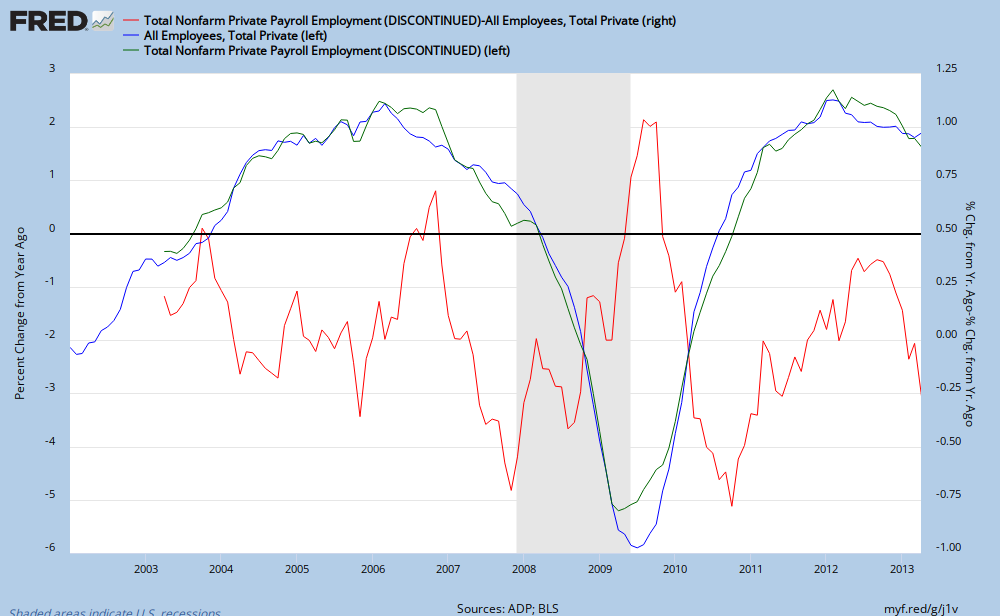
yoy employment data and divergence them
source: Federal Reserve
The green and blue lines are the ADP and government year over year employment growth data, left scale and the red jagged line is the difference between their growth rates, right scale. What's noticeable is the divergence between them. While it would be better to show just the absolute difference between them regardless of sign, I'm not enough of a FRED graph Meister to figure that out right now. Right now the >0.35% difference between them is the largest on record for this data series.
Is this divergence truly exceptional? It may have been greater in the past and only later revisions tightened up the spread.
I'm not making a prediction as to which is wrong, merely it's likely the spread will narrow in the future.

Greg,
ReplyDeleteboth ADP and BLS data are subject to gross revisions over time. For instance, original payrolls numbers released in first months of 2009 were revised down later as much as 1.6 million.
The only way to determine whether current divergence is unusual is to compare series of original releases. Which, of course, require a certain amount of efforts.
Absolutely correct, we may see some serious revision in the numbers later on. That is one reason I took a screen shot and posted it. I'm curious as to if we will see the same situation with this current divergence.
ReplyDelete