Showing posts with label unemployment. Show all posts

Thursday, February 21, 2013

A warning from the unemployment line

The weekly initial claims for unemployment data was released today and it is getting close to being a concern of mine.

Year over year change, initial unemployed claims - Source Federal Reserve
As can be seen from this chart of *non seasonally adjusted and *4 week average of seasonally adjusted data, (the noisiest and smoothest interpretations of this data series) the rate of decline has effectively stopped. Yes there were some spikes upwards during the hurricane Sandy and blizzard Nemo, but the trend has started to move upwards after spending most of 2011 and 2012 fluctuating around an annual decline in jobs  unemployment claims of ~40,000.

We are now near the break-even mark and if it starts to consistently go positive, (more people laid off now as compared to last year) this would be a very strong warning flag to the US economy.

Considering the recent payroll tax hike and other tax increases recently imposed it is possible we may see this happen.

Thursday, January 12, 2012

Seasonality and initial unemployment claims

Weekly initial unemployment claims were released today and they showed an increase to 399,000, countering the recent downward trend.  Details can be found at the DOL

I would not make much of the current gyrations, up and down. As the graph below shows, right now we are at the highest seasonal peak of layoffs/firings.  Each year you can see a massive increase in initial claims just around the new year. This makes estimating the trend very difficult.  (Translation, put very large error bars on data around the new year)


I wonder how many financial models out there reduce the weight of this data (and other series) when they are less accurate?  

Here's the two data series on a year over year basis.  While initial claims are still declining the rate of decline appears to have leveled off. 


Tuesday, May 17, 2011

Initial unemployment claims are going the wrong way

Initial unemployment claims are starting to creep back upwards on an absolute and year over year basis.  The standard seasonally adjusted 4 week moving average of initial claims (that's a mouthful!) has recently bounced back up to 440k from 400k.

While this does not look so bad if one looks at the data on an absolute level, one can see the trend clearly deteriorating on a year over basis [2nd chart]

Now this is only a few weeks but the trend is not going in the 'right' direction.  My previous post on initial claims data  provided two different theoretical outcomes merely by torturing the data via different means.

Some have posited the rise in initial clams is due to automotive factories laying off people because of supply chain problems stemming from the earthquake in Japan a few months back.  Another possibility is the increase in oil prices is finally starting to really bite into the consumers pocketbook and layoffs are ensuing in consumer sensitive sectors of the economy.  Regardless we will know soon if this is a short term blip in unemployment claims or a longer term trend.

Thursday, February 3, 2011

Torturing the initial claims data

Initial unemployment claims data came out today and weekly unemployment claims decreased to 415,000.  The number has bounced around quite a bit recently causing some gyrations in the market and I thought it would be instructive to dig down a little further into the data.

One item to note from this first graph is how volatile the raw data is.  Note how around year end the unemployment claims spike up dramatically. Compare the raw data to the 4 week moving average seasonally adjusted data and you can understand why the claims data has bounced around so much recently; we are in the post holiday layoff period.

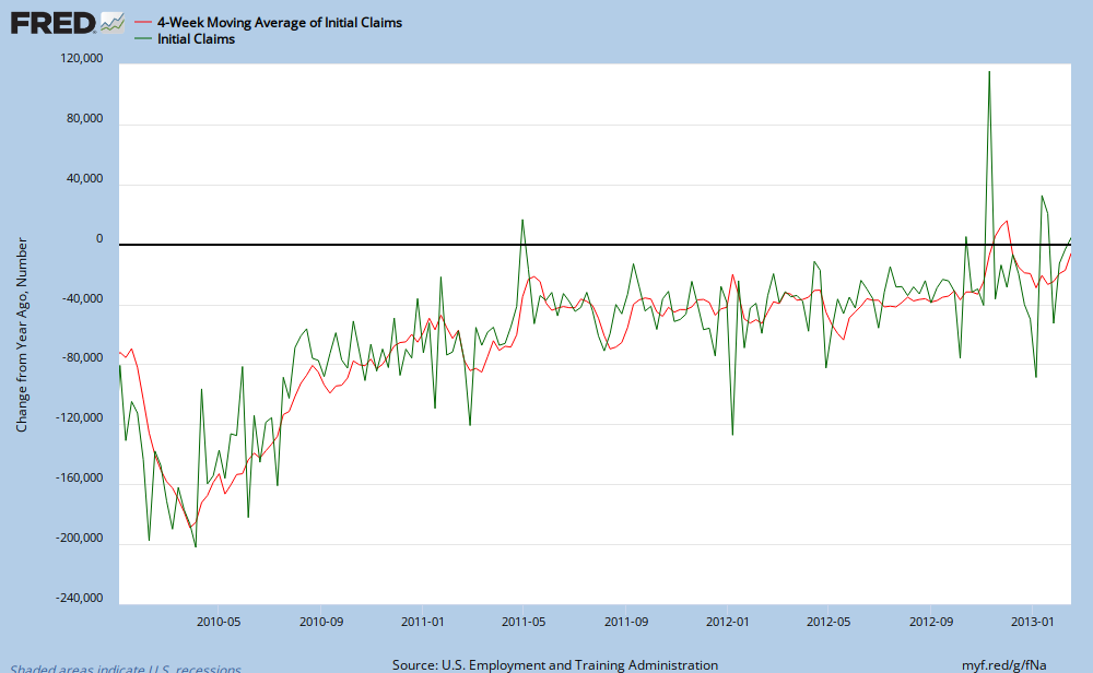
Next let us examine the year over year change in initial claims. What is actually impressive to me is how close the raw data and 4 week seasonal data track each other.   (Note these two graphs do not show today's data)  I have drawn in some black lines showing the rise starting in 2008, a peak in early March 2009 and then a bottom and rebound in early 2010.  Note this is the change in claims and as you can see we are still dropping on a year over year basis but the rapid fall in initial claims has ended and we are trending back towards zero. You can also see the most recent raw claims data is bouncing around quite a bit, again due to seasonal affects and possibly the weather.


Is the glass half empty or half full?
We can torture the data a bit further and just for fun and see what models predict will happen next. Using March 27, 2010 as the baseline (the peak in the rate of decline in initial claims)  I let excel extrapolate the data out another 15 weeks.  Bottom line is you can come up with either a positive or negative prediction depending upon how may polynomials you use.

Using a 2 polynomial regression predicts (R2 of .9712) claims are near their deceleration point and will then continue to keep dropping over time.

You want a bearish case? No problem!  Using a 5 polynomial  (R2 of .9763) regression initial unemployment claims will eventually reverse their fall in 12 weeks or so and start to rise on a year over year basis

Please note I'm not making economic predictions here, I'm just looking at the shape of a graph.  Going forward we have several cross currents pulling claims in opposite directions.  ISM data has been quite positive which may bode well for fewer layoffs in the future.  On the negative side we have higher food and energy prices as well as continues austerity by the states and municipalities.  As always stay tuned and I'll keep you informed.

HT creditwritedowns
He has done some great work on this data series and his articles were the genesis of this post:
http://www.creditwritedowns.com/2011/01/is-the-government-data-fudging-jobless-claims.html
http://www.creditwritedowns.com/2010/09/jobless-claims-still-not-pointing-to-imminent-double-dip-recession.html


Monday, October 11, 2010

Initial unemployment claims - Treading water

While I touched on initial unemployement claims before in an attempt to see if Google Trends could accurately predict changes, (failure!)  other people have shown the change in initial unemployment claims provides some predictive value. Creditwritedowns writes about how looking at the year over year change in unemployement claims provides insight into changes in consumer spending in America.   In short, a year over year decline in initial unemployment claims forebodes postive growth in the economy.

Let us take a look at the data (Source: Federal Reserve)


Looking at the year over year percent change in initial unemployement claims all appears well. The year over year number is negative meaning fewer people are getting laid off each week. 

There is a problem with this prognosis however and you can see it looking at the absolute numbers in the second graph. In chart two initial unemployment claims have remained quite stubborn for 2010, refusing to drop below the ~440k number for the entire year.   In a couple months if unemployment claims don't start falling our year over year metric will flatten out.  Right now the employement situation is treading water and this meshes well with the general sluggish feel to the economy.  

Right now this economic indicator is flashing Yellow.

Wednesday, July 21, 2010

Unemployment claims and Google trends continue to diverge

One of my topics (and headscratchers) recently has been the disparity between the Google Trends unemployment data and initial unemployment claims data from the government.  While both of them are trending upwards the difference between the two data series grows. 

Here's a few possible reasons why:

  • The Google Trends data changes. A lot.  As I update my data series I have noticed the entire set has changed (all the way back to 2005!) up to 10%  Comparing the older and newer data series gives you the same shape of the graph for year over year purposes but seeing data change that much is perplexing.  I've emailed Google about this but we'll see if I get any response. 
  • The strong seasonality of layoffs (Go look at the government non seasonally adjusted data. It is very 'spikey') could be making the two series non comparable at this time of year. Even though both series are compared on a year over year basis something may still be incorrect.
  • There could just be anxiety about losing ones job right now and those searches are showing up in the Google data.
  • Census workers are getting laid off right now and looking for new jobs but they may not be showing up in the unemployment claims data.
  • The Google data is relative to all other searches which should remove the bias of greater internet usage over time but it may not properly isolate this specific function used more as compared to others. 
Looking at the data you can see both series tend to follow the same direction but the Initial Claims data leads the Google Trends data (the graph is of a 30 day simple moving average of the daily data)  This time the Google data is leading the Initial Claims data (or is just plain wrong)  I could perhaps be asking too much of the Google data as well. Considering the slope of both is upwards I should perhaps call it good . . .

I don't have any bets placed due to this data but I'm still hopeful something can come of this series.  In a few hours we'll see if I'm still banging my head against a wall or onto something.

Source: Federal Reserve, Google

Thursday, July 8, 2010

Unemployement claims and Google Trends. Not much clarity.

Ok call that a whiff. . .  Initial unemployment claims were released today and showed a decline.  I'm going to keep my eye on these series and see if the two continue to diverge  . . .

Wednesday, July 7, 2010

Google Unemployment Trends rising. Will initial claims follow suit?

I recently mentioned the correlation between Google Trends data on unemployment and initial unemployment claims data published by the government.  As you can see, in the short period of time since that last post the Google Trends data has risen dramatically.

I do not know if this is due to all the newly unemployed Census workers re-entering the ranks of the unemployed or if it is actually due to an 'unexpected' jump in initial claims.  We'll have more clarity in a few hours.

Either way the trend is not positive . . .

Source:
Federal Reserve, Google

Friday, July 2, 2010

Is Google Trends providing a sneak peak into the employment situation?

The employment report was released today and the results were weaker than expected.  From Bloomberg the consensus was for +105,000 private sector jobs while the number was actually 83,000.  Here's a little insight on who was not surprised.

Google Trends provides very interesting data regarding search terms over time.  One of the data series reported daily is the unemployment index consisting of search terms such as 'unemployment' and 'unemployment benefits'.   As you can see from this Google chart the growth of the unemployment index peaked in early 2009 and until very recently was consistently declining.

Comparing the year over year percent change in the 30 day smoothed Google Trends unemployment index to the Four Week Initial Claims as reported by the government is very instructive.  While there is noise it is very impressive how similar the trends and turning points are for each data series.

The recent 'unexpected increases' in Initial Claims coincides with the Google data basing and again turning upwards.  If you want to handicap future unemployment and initial claims reports starting with Google Trends will improve your odds. 

Other Google Trends reports are available on a plethora of topics and you'd be amazed at what you'll find.

Additional reading:
Voxeu.org

Predicting Initial Claims for Unemployment Benefits -- Hyunyoung Choi, Hal Varian

Friday, January 29, 2010

Temporary Workers -- less worse

I know I know, I'm a bit late in producing this but I've been busy the last few weeks and the usual charts and graphs data feed has fallen to the wayside a bit.

Employment data came out a while ago and the temporary employment subsection showed some improvement in the famous 'second derivative' department. 

Unlike some other people who look at seasonally adjusted data I prefer to look at the non seasonally adjusted series, noise and all. 

December was higher than November, which is unusual.  It could be later hiring for the Christmas rush or the census hiring hitting.  As such the yoy% change was a bit higher than I expected.

 I have added a new line to the graph 'min max average'.  This line is constructed by averaging the max point over the last 14 months and  the minimum data point over the last 14 months.  I use 14 months because the peak and valley for temporary employment can each sometimes vary by a month.  Generally this min max average and the %yoy change confirm each others movements but I thought looking at the data a slightly different way would be interesting.  The min max average continues to drop.

Census hiring is supposed to peak during the summer months and thus hopefully not screw up this data series too much.  Right now it is showing a 'less worse' situation but still NO growth. 

Wednesday, November 25, 2009

Temporary workers -- data from the front lines

Temporary workers are the first to be fired and hired by companies as they attempt to balance demands and costs.  As you can see temporary worker employment is very seasonal, usually peaking around October and quickly falling to a seasonal low around January.

The usual 'spike' in temporary workers did not happen last year and the dropoff in temporary workers this recession is much larger than in 2000-2001.  As such year over year data will be less predictive until we settle into a new normal but on a longer term basis this data set is a good way to sense the pulse of corporate hiring and firing.  How many temporary workers are around in the nadir of 2010 employment sometime in January / February will be the next time we can start to tease out any real information.  I'll keep you informed.